This is to attempt the bivariate maps as done by Timo Grossenbacher as show in his blog. I will try and replicate it for the state of Bihar in India.
Libraries
library(tidyverse)## -- Attaching packages --------- tidyverse 1.3.0 --## v ggplot2 3.3.1 v purrr 0.3.4
## v tibble 3.0.1 v dplyr 1.0.0
## v tidyr 1.0.3 v stringr 1.4.0
## v readr 1.3.1 v forcats 0.5.0## Warning: package 'ggplot2' was built under R version 3.6.3## Warning: package 'tibble' was built under R version 3.6.3## Warning: package 'purrr' was built under R version 3.6.3## Warning: package 'dplyr' was built under R version 3.6.3## Warning: package 'forcats' was built under R version 3.6.3## -- Conflicts ------------ tidyverse_conflicts() --
## x dplyr::filter() masks stats::filter()
## x dplyr::lag() masks stats::lag()library(magrittr)##
## Attaching package: 'magrittr'## The following object is masked from 'package:purrr':
##
## set_names## The following object is masked from 'package:tidyr':
##
## extractlibrary(sf)## Warning: package 'sf' was built under R version 3.6.3## Linking to GEOS 3.8.0, GDAL 3.0.4, PROJ 6.3.1library(raster)## Warning: package 'raster' was built under R version 3.6.3## Loading required package: sp## Warning: package 'sp' was built under R version 3.6.3##
## Attaching package: 'raster'## The following object is masked from 'package:magrittr':
##
## extract## The following object is masked from 'package:dplyr':
##
## select## The following object is masked from 'package:tidyr':
##
## extractlibrary(viridis)## Loading required package: viridisLitelibrary(cowplot)## Warning: package 'cowplot' was built under R version 3.6.3##
## ********************************************************## Note: As of version 1.0.0, cowplot does not change the## default ggplot2 theme anymore. To recover the previous## behavior, execute:
## theme_set(theme_cowplot())## ********************************************************library(plotly)## Warning: package 'plotly' was built under R version 3.6.3##
## Attaching package: 'plotly'## The following object is masked from 'package:raster':
##
## select## The following object is masked from 'package:ggplot2':
##
## last_plot## The following object is masked from 'package:stats':
##
## filter## The following object is masked from 'package:graphics':
##
## layoutlibrary(ggiraph)Diverting from how the blog instructs to load packages. This is reckless Coding
Importing data
I have district level shape files of bihar. Courtesy of a friend I have some district level indicator such as number of households , population, area etc…. Thanks Ani for the files.
read_sf("DistrictsClean.shp") -> DistrictshapesHow does this shp file looks like?
class(Districtshapes)## [1] "sf" "tbl_df" "tbl" "data.frame"so it has sf class variables, those that come with shape files. And the regular culprits such as data frames and tbl.
names(Districtshapes)## [1] "DISTRICT_I" "NAME" "STATE_UT" "C_CODE01" "TOT_AREA"
## [6] "TOT_NM_HH" "TOT_POP" "M_POP" "F_POP" "TOT_L6"
## [11] "M_L6" "F_L6" "TOT_SC" "M_SC" "F_SC"
## [16] "TOT_ST" "M_ST" "F_ST" "TOT_LIT" "M_LIT"
## [21] "F_LIT" "TOT_ILLT" "M_ILLT" "F_ILLT" "TOT_W"
## [26] "M_W" "F_W" "TOT_MNW" "M_MNW" "F_MNW"
## [31] "TOT_CULT" "M_CULT" "F_CULT" "TOT_AGLB" "M_AGLB"
## [36] "F_AGLB" "TOT_MFHH" "M_MFHH" "F_MFHH" "TOT_OTH_W"
## [41] "M_OTH_W" "F_OTH_W" "TOT_MRW" "M_MRW" "F_MRW"
## [46] "T_MRG_CULT" "M_MRG_CULT" "F_MRG_CULT" "T_MRG_AGLB" "M_MRG_AGLB"
## [51] "F_MRG_AGLB" "T_MRG_HH" "M_MRG_HH" "F_MRG_HH" "T_MRG_OTH"
## [56] "M_MRG_OTH" "F_MRG_OTH" "TOT_NNW" "M_NNW" "F_NNW"
## [61] "R_TOT_NM_H" "R_TOT_POP" "R_M_POP" "R_F_POP" "R_TOT_L6"
## [66] "R_M_L6" "R_F_L6" "R_TOT_SC" "R_M_SC" "R_F_SC"
## [71] "R_TOT_ST" "R_M_ST" "R_F_ST" "R_TOT_LIT" "R_M_LIT"
## [76] "R_F_LIT" "R_TOT_ILLT" "R_M_ILLT" "R_F_ILLT" "R_TOT_W"
## [81] "R_M_W" "R_F_W" "R_TOT_MNW" "R_M_MNW" "R_F_MNW"
## [86] "R_TOT_CULT" "R_M_CULT" "R_F_CULT" "R_TOT_AGLB" "R_M_AGLB"
## [91] "R_F_AGLB" "R_TOT_MFHH" "R_M_MFHH" "R_F_MFHH" "R_TOT_OTH_"
## [96] "R_M_OTH_W" "R_F_OTH_W" "R_TOT_MRW" "R_M_MRW" "R_F_MRW"
## [101] "R_T_MRG_CU" "R_M_MRG_CU" "R_F_MRG_CU" "R_T_MRG_AG" "R_M_MRG_AG"
## [106] "R_F_MRG_AG" "R_T_MRG_HH" "R_M_MRG_HH" "R_F_MRG_HH" "R_T_MRG_OT"
## [111] "R_M_MRG_OT" "R_F_MRG_OT" "R_TOT_NNW" "R_M_NNW" "R_F_NNW"
## [116] "U_TOT_NM_H" "U_TOT_POP" "U_M_POP" "U_F_POP" "U_TOT_L6"
## [121] "U_M_L6" "U_F_L6" "U_TOT_SC" "U_M_SC" "U_F_SC"
## [126] "U_TOT_ST" "U_M_ST" "U_F_ST" "U_TOT_LIT" "U_M_LIT"
## [131] "U_F_LIT" "U_TOT_ILLT" "U_M_ILLT" "U_F_ILLT" "U_TOT_W"
## [136] "U_M_W" "U_F_W" "U_TOT_MNW" "U_M_MNW" "U_F_MNW"
## [141] "U_TOT_CULT" "U_M_CULT" "U_F_CULT" "U_TOT_AGLB" "U_M_AGLB"
## [146] "U_F_AGLB" "U_TOT_MFHH" "U_M_MFHH" "U_F_MFHH" "U_TOT_OTH_"
## [151] "U_M_OTH_W" "U_F_OTH_W" "U_TOT_MRW" "U_M_MRW" "U_F_MRW"
## [156] "U_T_MRG_CU" "U_M_MRG_CU" "U_F_MRG_CU" "U_T_MRG_AG" "U_M_MRG_AG"
## [161] "U_F_MRG_AG" "U_T_MRG_HH" "U_M_MRG_HH" "U_F_MRG_HH" "U_T_MRG_OT"
## [166] "U_M_MRG_OT" "U_F_MRG_OT" "U_TOT_NNW" "U_M_NNW" "U_F_NNW"
## [171] "geometry"That geometry variable is the sf object, lets look at it.
Districtshapes$geometry## Geometry set for 37 features
## geometry type: MULTIPOLYGON
## dimension: XY
## bbox: xmin: 83.33773 ymin: 24.28994 xmax: 88.27686 ymax: 27.52084
## geographic CRS: WGS 84
## First 5 geometries:## MULTIPOLYGON (((87.03249 26.55531, 87.03252 26....## MULTIPOLYGON (((84.44741 25.12905, 84.45005 25....## MULTIPOLYGON (((86.70367 25.11084, 86.70378 25....## MULTIPOLYGON (((86.03136 25.72544, 86.03167 25....## MULTIPOLYGON (((86.82654 25.44135, 86.82758 25....Note that the blog imports shape files of the canton (swiss municipalties), country border and lakes. I will only use the district shape files. This is because I am lazy.
Also I could not find relief data for districts of Bihar. Here goes the chance at beautiful hill sides.
This brings us directly to definig the theme of the map
Below is the code chuck directly copied from the blog, with some minor tweaks.
theme_map <- function(...) {
theme_minimal() +
theme(
text = element_text(color = "#666666"),
# remove all axes
axis.line = element_blank(),
axis.text.x = element_blank(),
axis.text.y = element_blank(),
axis.ticks = element_blank(),
# add a subtle grid
panel.grid.major = element_blank(),
panel.grid.minor = element_blank(),
# background colors
plot.background = element_rect(fill = "#F1EAEA",
color = NA),
panel.background = element_rect(fill = "#F1EAEA",
color = NA),
legend.background = element_rect(fill = "#F1EAEA",
color = NA),
# borders and margins (I have commented these as these generate an error with the plotly, else it works perfect)
# plot.margin = unit(c(.5, .5, .2, .5), "cm"),
# panel.border = element_blank(),
# panel.spacing = unit(c(-.1, 0.2, .2, 0.2), "cm"),
# titles
legend.title = element_text(size = 11),
legend.text = element_text(size = 9, hjust = 0,
color = "#666666"),
plot.title = element_text(size = 15, hjust = 0.5,
color = "#666666"),
plot.subtitle = element_text(size = 10, hjust = 0.5,
color = "#666666",
margin = margin(b = -0.1,
t = -0.1,
l = 2,
unit = "cm"),
debug = F),
# captions
plot.caption = element_text(size = 7,
hjust = .5,
margin = margin(t = 0.2,
b = 0,
unit = "cm"),
color = "#939184"),
...
)
}The section on borders and margins in the above code chunk is what i learnt new from this.
Now since the funciton to define theme of a map is created. Next step is to create a univariate map.
Creating Univariate Choropleth
First setp is to create quantiles. I do this differently from how the blog does it, as I am more comfortable this way
Districtshapes$TOT_POP %>%
quantile(probs = seq (0,1, length.out = 7)) %>%
as.vector() -> quantileshere are the quantiles
quantiles## [1] 515961 1296348 1608773 2243144 2543942 3295789 4718592The next step after creating quantiles is to create labes
# the imap_chr function is a short hand for map2 from purrr, i did not know this lets try it out .
imap_chr(quantiles, function(., idx){
return(paste0(round(quantiles[idx]/1000,0),
"K",
"-",
round(quantiles[idx+1]/1000,0), "K"))
}) -> labelsThis is how the labels look. These will be used as legends
labels## [1] "516K-1296K" "1296K-1609K" "1609K-2243K" "2243K-2544K" "2544K-3296K"
## [6] "3296K-4719K" "4719K-NAK"We remove the last label, as it would make no sense to have it.
labels[1:length(labels) - 1] -> labelsOne could have done this by labels[1:6] -> labels, howevere what Timo uses is better for reproducibility and incase one changes their mind to vary the levels of labels.
Next step is creating the new variable in the new data frame.
Districtshapes %>%
mutate(
mean_quantiles = cut(TOT_POP,
breaks = quantiles,
labels = labels,
include.lowest = T)) -> Districtshapeslets take a peek at how it looks.
Districtshapes[, c("NAME", "TOT_POP", "mean_quantiles")]## Simple feature collection with 37 features and 3 fields
## geometry type: MULTIPOLYGON
## dimension: XY
## bbox: xmin: 83.33773 ymin: 24.28994 xmax: 88.27686 ymax: 27.52084
## geographic CRS: WGS 84
## # A tibble: 37 x 4
## NAME TOT_POP mean_quantiles geometry
## <chr> <dbl> <fct> <MULTIPOLYGON [°]>
## 1 Araria 2158608 1609K-2243K (((87.03249 26.55531, 87.03252 26.5556, 87.0~
## 2 Auranga~ 2013055 1609K-2243K (((84.44741 25.12905, 84.45005 25.12784, 84.~
## 3 Banka 1608773 1296K-1609K (((86.70367 25.11084, 86.70378 25.11085, 86.~
## 4 Begusar~ 2349366 2243K-2544K (((86.03136 25.72544, 86.03167 25.72567, 86.~
## 5 Bhagalp~ 2423172 2243K-2544K (((86.82654 25.44135, 86.82758 25.44194, 86.~
## 6 Bhojpur 2243144 1609K-2243K (((84.60561 25.73218, 84.60769 25.7325, 84.6~
## 7 Buxar 1402396 1296K-1609K (((83.92998 25.56238, 83.93465 25.56408, 83.~
## 8 Darbhan~ 3295789 2544K-3296K (((85.77015 26.42577, 85.76987 26.4248, 85.7~
## 9 Gaya 3473428 3296K-4719K (((84.73768 25.05326, 84.73875 25.05271, 84.~
## 10 Gopalga~ 2152638 1609K-2243K (((84.41673 26.63697, 84.42119 26.63769, 84.~
## # ... with 27 more rowsIt is seen that each district is classified in respective quantile it should fall in under the mean_quantiles variable.
Now we plot with ggplot and sf.
Districtshapes %>%
ggplot()+
geom_sf(aes(fill = mean_quantiles), colour = "white", size = 0.1)+
scale_fill_viridis(
option = "magma",
"Populations across districts",
alpha = 0.8,
begin = 0.1,
end = 0.9,
discrete = T,
direction = 1,
guide = guide_legend(
keyheight = unit(5, units = "mm"),
title.position = "top",
reverse = T
)
)+
labs(
x = NULL,
y = NULL,
title = "Bihar: Population of Districts",
caption = "by :Ayush Patel\n inspired from Timo Grossenbacher"
)+
theme_map() -> DistPOPChoropleth
ggsave(filename = "MAP_districtPopulation.png", plot = DistPOPChoropleth, device = png())## Saving 6.67 x 6.67 in imageThis is how the map looks.
DistPOPChoropleth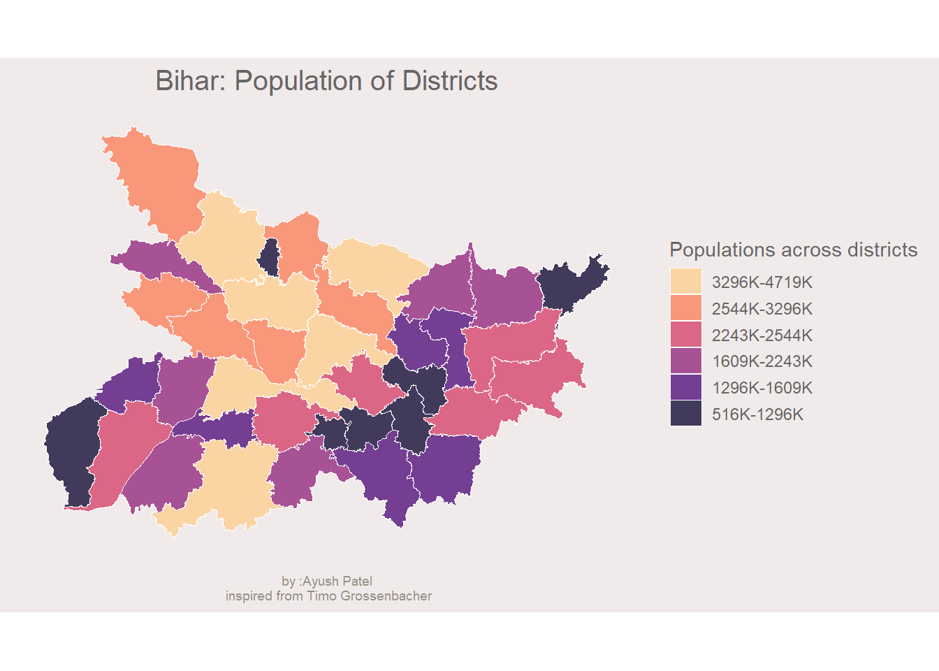
Lets take a little detour from the blog and see if the ggplotly funciton works on this map, just for fun.
ggplotly(DistPOPChoropleth)NOw that the univariate Choropleth is made lets move on.
Creating the Bivariate Colour Scale
Note that the bivariate colour scale is made using some other software, ‘sketch’ is the one used in the blog. The blog points to a write up on creating colour codes for the bivariate colour scheme by Joshua Stevens. This is an interesting read.
Below is the code chunk from the blog, with some minor tweaks, to create the bivariate colour scheme.
# create 3 buckets for Area
Districtshapes$TOT_AREA %>%
quantile(probs = seq(0, 1, length.out = 4)) -> quantiles_Area
# create 3 buckets for Area
Districtshapes$TOT_POP %>%
quantile(probs = seq(0, 1, length.out = 4)) -> quantiles_Pop
# create color scale that encodes two variables
# red for Area and blue for POP
# the special notation with gather is due to readibility reasons
bivariate_color_scale <- tibble(
"3 - 3" = "#3F2949", # high inequality, high income
"2 - 3" = "#435786",
"1 - 3" = "#4885C1", # low inequality, high income
"3 - 2" = "#77324C",
"2 - 2" = "#806A8A", # medium inequality, medium income
"1 - 2" = "#89A1C8",
"3 - 1" = "#AE3A4E", # high inequality, low income
"2 - 1" = "#BC7C8F",
"1 - 1" = "#CABED0" # low inequality, low income
) %>%
gather("group", "fill")Joinig the colour codes to the data.
# cut into groups defined above and join fill
Districtshapes %<>%
mutate(
Area_quantiles = cut(
TOT_AREA,
breaks = quantiles_Area,
include.lowest = TRUE
),
POP_quantiles = cut(
TOT_POP,
breaks = quantiles_Pop,
include.lowest = TRUE
),
# by pasting the factors together as numbers we match the groups defined
# in the tibble bivariate_color_scale
group = paste(
as.numeric(Area_quantiles), "-",
as.numeric(POP_quantiles)
)
) %>%
# we now join the actual hex values per "group"
# so each municipality knows its hex value based on the his gini and avg
# income value
left_join(bivariate_color_scale, by = "group")Drawing the Bivariate MAP
The blog mentions that to define from where the arrows begin and end for annontation, they looked at the swiss map manually and figured out the values. As I mentioned before that I am lazy, I will skip the annontaions altogether.
Drawing the map
map <- ggplot(
# use the same dataset as before
data = Districtshapes
) +
# color municipalities according to their gini / income combination
geom_sf(
aes(
fill = Districtshapes$fill
),
# use thin white stroke for municipalities
color = "white",
size = 0.1
) +
scale_fill_identity()+
# add titles
labs(x = NULL,
y = NULL,
title = "Population Density for Districts of Bihar",
caption = "by :Ayush Patel\n inspired from Timo Grossenbacher") +
# add the theme
theme_map()Drawing the legend
# separate the groups
bivariate_color_scale %<>%
separate(group, into = c("Area", "Pop"), sep = " - ") %>%
mutate(Area = as.integer(Area),
Pop = as.integer(Pop))
legend <- ggplot() +
geom_tile(
data = bivariate_color_scale,
mapping = aes(
x = Area,
y = Pop,
fill = fill)
) +
scale_fill_identity() +
labs(x = "Larger Area--->",
y = "Higher Population--->") +
theme_map() +
# make font small enough
theme(
axis.title = element_text(size = 6)
) +
# quadratic tiles
coord_fixed()Combining the map and the legend
ggdraw() +
draw_plot(map, 0, 0, 1, 1) +
draw_plot(legend, 0.75, 0.07, 0.15, 0.15) -> Biharbivariate## Warning: Use of `Districtshapes$fill` is discouraged. Use `fill` instead.This is how the map looks
Biharbivariate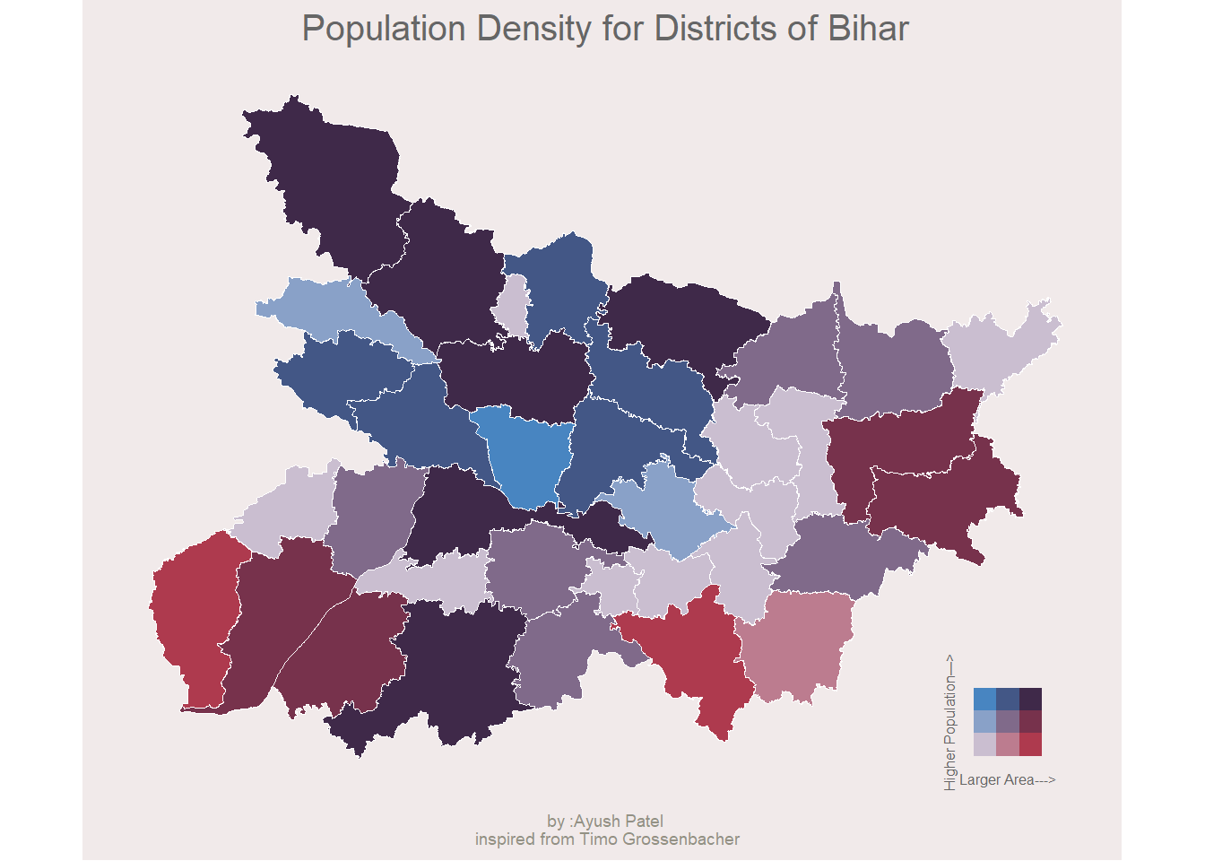
ggsave(filename = "BivariateBiharPopulationDensity.png", plot = Biharbivariate, device = png())## Saving 6.67 x 6.67 in imageI think I did OK.
What if one wants a univariate map with additional geoms that are interactive in nature??
psst: I would suggest that if you are adding only one additional geom over the map, make it a bivariate map.
Any how, lets start from the univariate map that was just made. Here is how it looks incase you forgot.
DistPOPChoropleth
You forgot how this looked, didnt you?
Pay attention
Now, say to this map i want to add literacy leves as points and the size of these points mapped to the literacy level.
lets write a code for this.
# since the data dosent have rate of female literacy, lets make it
Districtshapes$litFrate = Districtshapes$F_LIT*100/Districtshapes$F_POP
# before we start making points, we have to go through some pain of points on surface
st_coordinates(st_point_on_surface(Districtshapes)) -> dat_pointsonsurface## Warning in st_point_on_surface.sf(Districtshapes): st_point_on_surface assumes
## attributes are constant over geometries of x## Warning in st_point_on_surface.sfc(st_geometry(x)): st_point_on_surface may not
## give correct results for longitude/latitude dataas.data.frame(dat_pointsonsurface)-> dat_pointsonsurface
dat_pointsonsurface$femaleLitRate = Districtshapes$litFrate
### now to the main task
Districtshapes %>%
ggplot()+
geom_sf(aes(fill = mean_quantiles), colour = "white", size = 0.1)+
scale_fill_viridis(
option = "magma",
"Populations across districts",
alpha = 0.8,
begin = 0.1,
end = 0.9,
discrete = T,
direction = 1,
guide = guide_legend(
keyheight = unit(5, units = "mm"),
title.position = "top",
reverse = T
)
)+
geom_point(data = dat_pointsonsurface, aes(x= X, y= Y, size = femaleLitRate),colour = "#89A1C8", alpha = 0.5)+
labs(
x = NULL,
y = NULL,
title = "Bihar: Population of Districts with literacy rates",
caption = "by :Ayush Patel\n inspired from Timo Grossenbacher"
)+
theme_map() -> addedgeomMap
addedgeomMap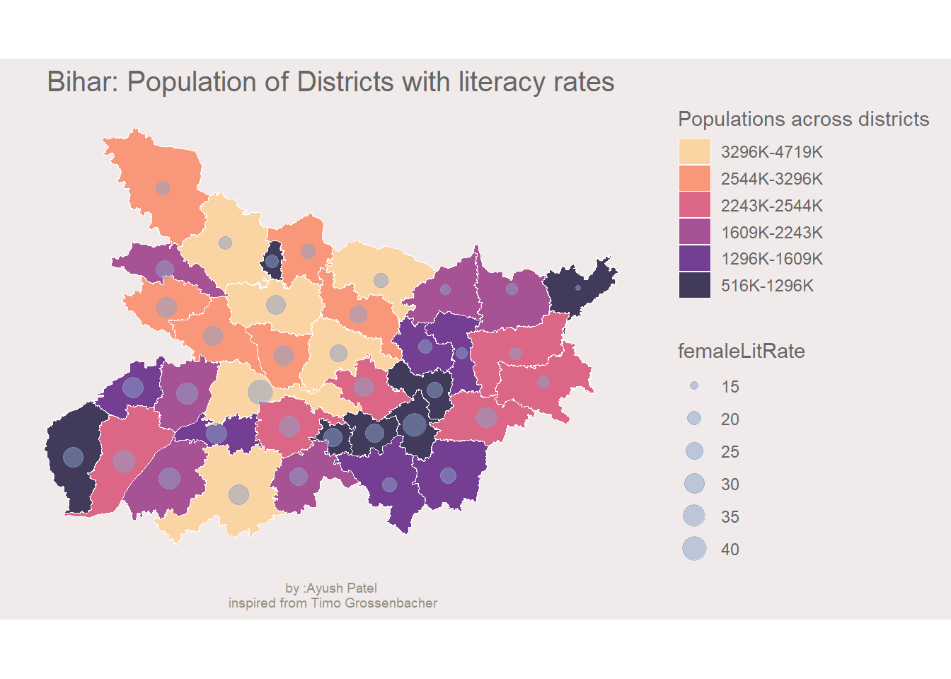
This is how ot looks. Female literacy rate are scaled to approximation. Lets see how would this look in plotly.
ggplotly(addedgeomMap)Notice how the legend for the point size is not shown, Plotly.js does not support multiple legends. However, on hovering tooltip over the chart we can see the female literacy rate.
BUTTT….
DO NOT WORRY GGIRAPH will save us
Districtshapes %>%
ggplot()+
geom_sf_interactive(aes(fill = mean_quantiles, tooltip = paste("population:",mean_quantiles)), colour = "white", size = 0.1)+
scale_fill_viridis_d_interactive(
option = "magma",
"Populations across districts",
alpha = 0.8,
begin = 0.1,
end = 0.9,
direction = 1,
guide = guide_legend(
keyheight = unit(5, units = "mm"),
title.position = "top",
reverse = T
)
)+
geom_point_interactive(data = dat_pointsonsurface, aes(X,Y, size = femaleLitRate,tooltip = paste("female literacy rate:",femaleLitRate)), alpha = 0.5, colour = "#806A8A")+
labs(
x = NULL,
y = NULL,
title = "Bihar: Population of Districts with literacy rates",
caption = "On encouragement and request of Dr Christian Oldiges\nmay he find all the right breaks"
)+
theme_map()->p
girafe(ggobj = p,width_svg = 8, height_svg = 4)## Warning: package 'gdtools' was built under R version 3.6.3HAHA! It works. Saved by ggiraph
Obiviously, I am Snape. Chris is Old.